MJML snippet
Best for assembling a full email from reusable sections.
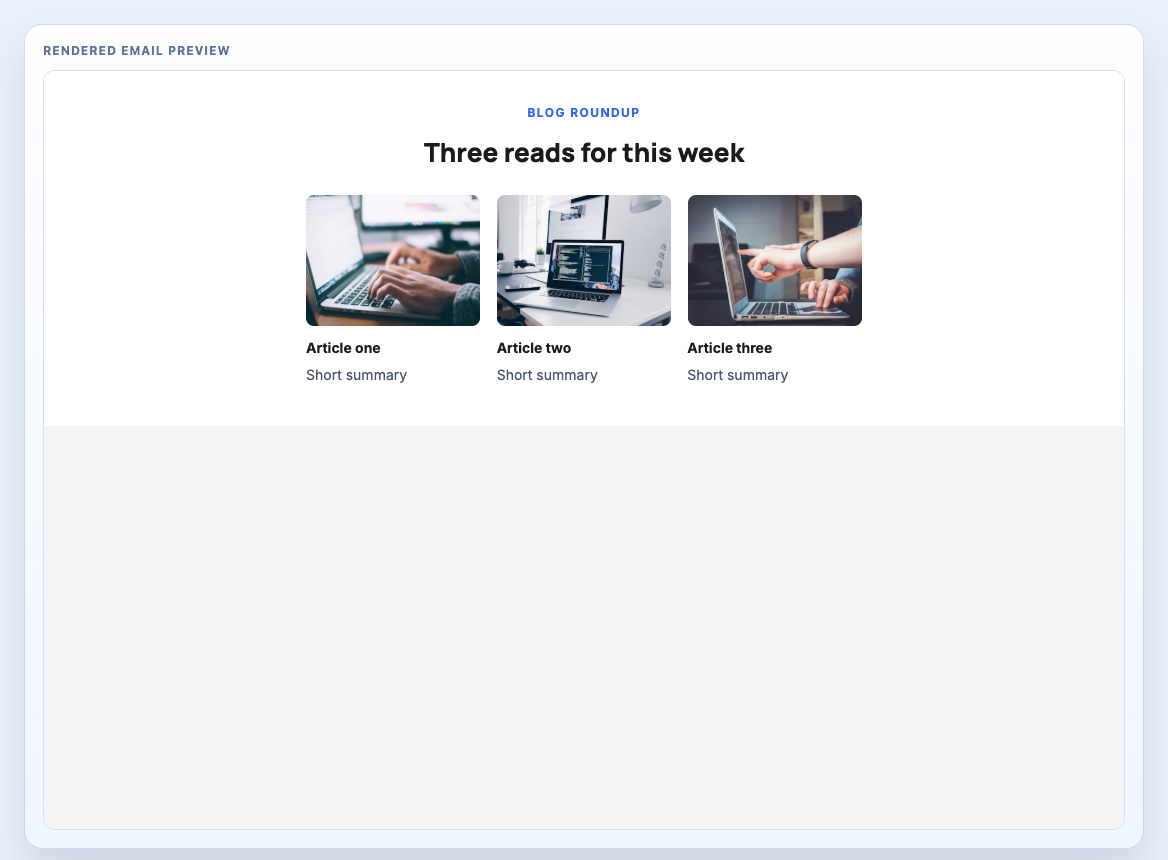
Three-article roundup grid for editorial newsletters, content marketing sends, and reading lists.
Treat the component as one production section inside a larger message system. Keep the shared classes and wrapper rules intact, then adapt the copy, imagery, and links to the send.
Copy the MJML snippet into the same body as your other blocks. Use standalone mode when testing this block on its own or exporting a full file for QA.
Best for assembling a full email from reusable sections.
Best for local testing or isolated compilation.
Best for ESP handoff, QA review, or HTML-only integrations.
Use these notes before moving the block into a campaign, layout system, or client handoff.
| Client | Status | Notes |
|---|---|---|
| Gmail (Web + Mobile) | Tested | Primary spacing, stack order, and CTA rendering hold up in Gmail web and mobile views. |
| Outlook Desktop (Windows) | Partial | Three-column article grids work well, though Outlook can tighten captions and stack the cards sooner. |
| Apple Mail (macOS + iOS) | Tested | No additional notes. |
| Yahoo Mail | Partial | Yahoo Mail may add extra vertical spacing around image-heavy cards, so summaries should stay compact. |
The panels below preserve the copy behaviour for MJML and compiled HTML. Template Hedgehog Pro includes the full offline archive for teams that need the complete system locally.
Snippet assembly: place this block inside the same <mj-body> as your other snippets, then stack sections in send order.
Editable source
Component block only. Use this when assembling an email from multiple reusable sections inside a project that already includes the shared MJML classes.
Formatting code preview...Compiled output
Component-only compiled markup for block-level inspection and HTML assembly workflows.
Formatting code preview...Use these references to see how the block fits into larger message systems.
Two-by-two article grid for heavier editorial newsletters, curated reading, and content roundups.
Lead-story feature block for newsletter intros, editorial campaigns, and long-form content sends.
Short editorial intro block for newsletters and digest-style sends.